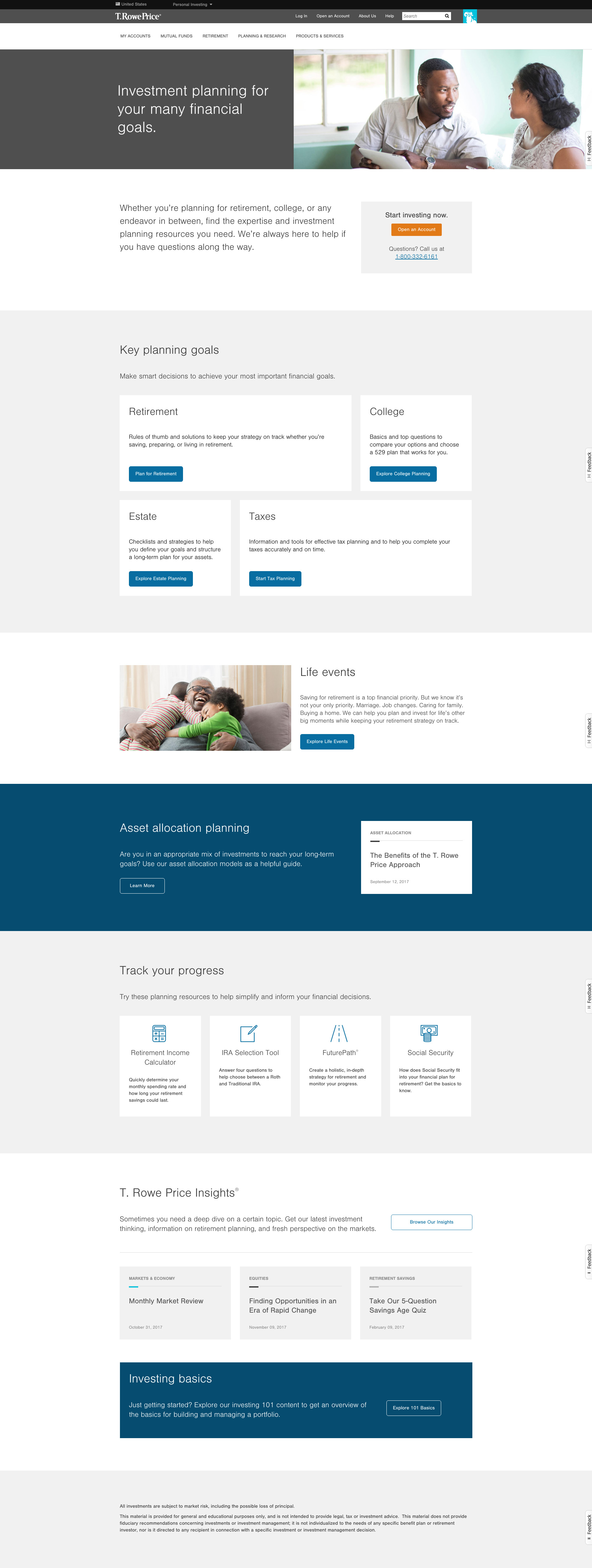
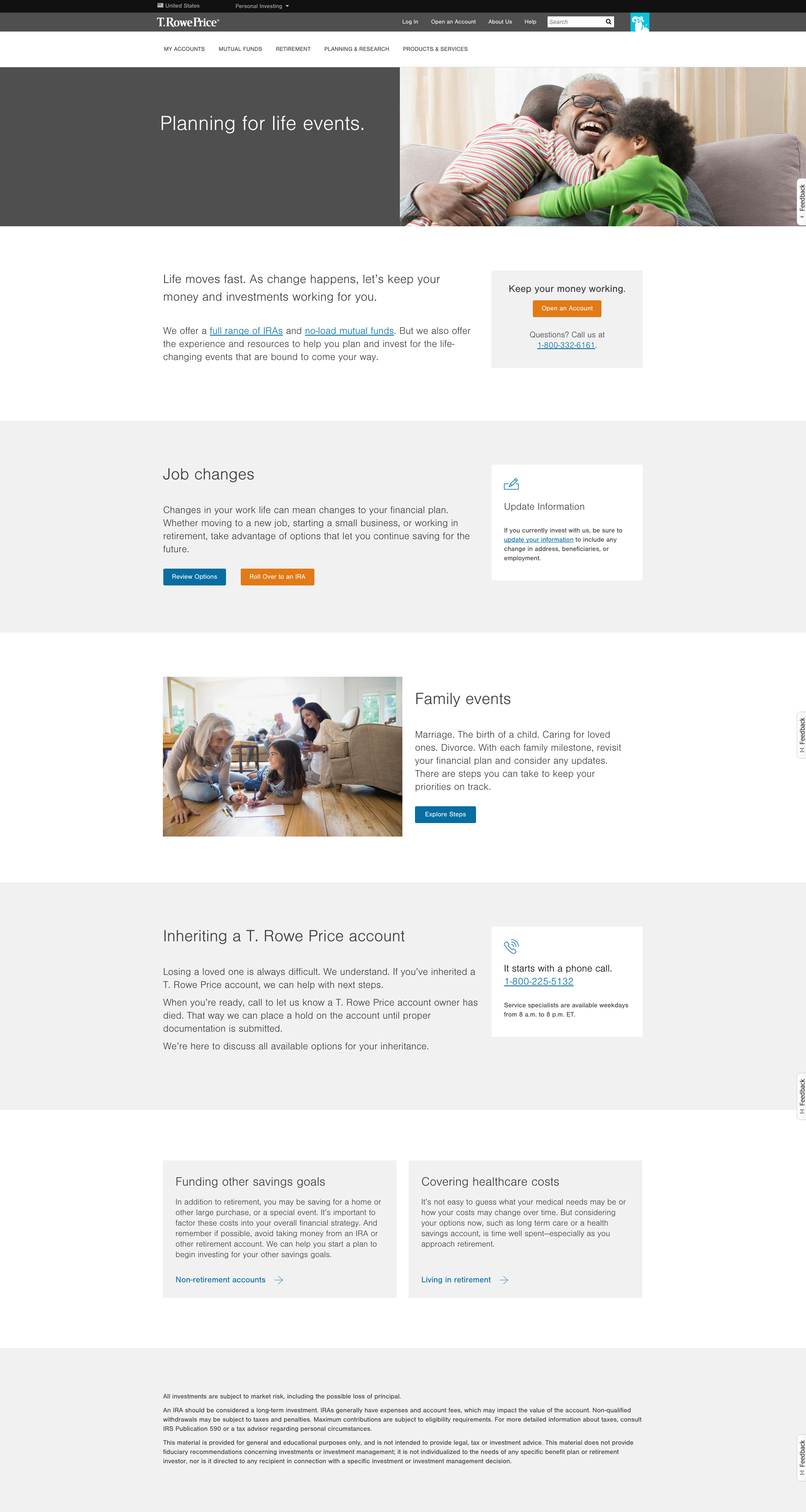
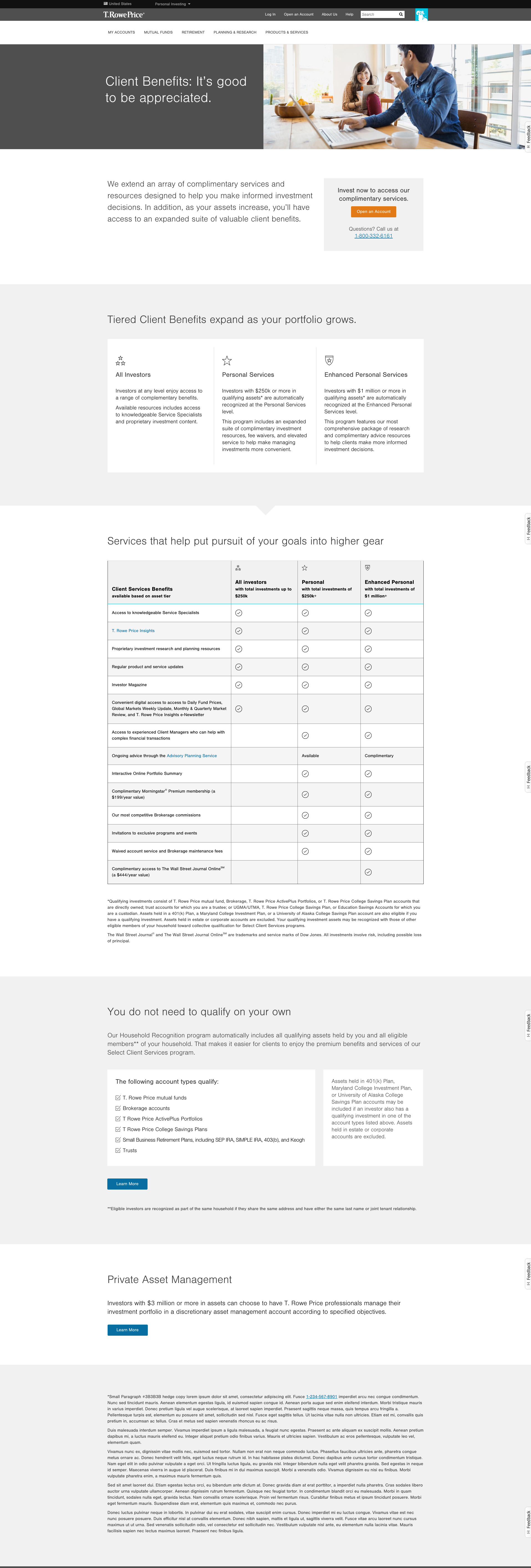
T. Rowe Price - Advice & Planning Website Overhaul

Situation
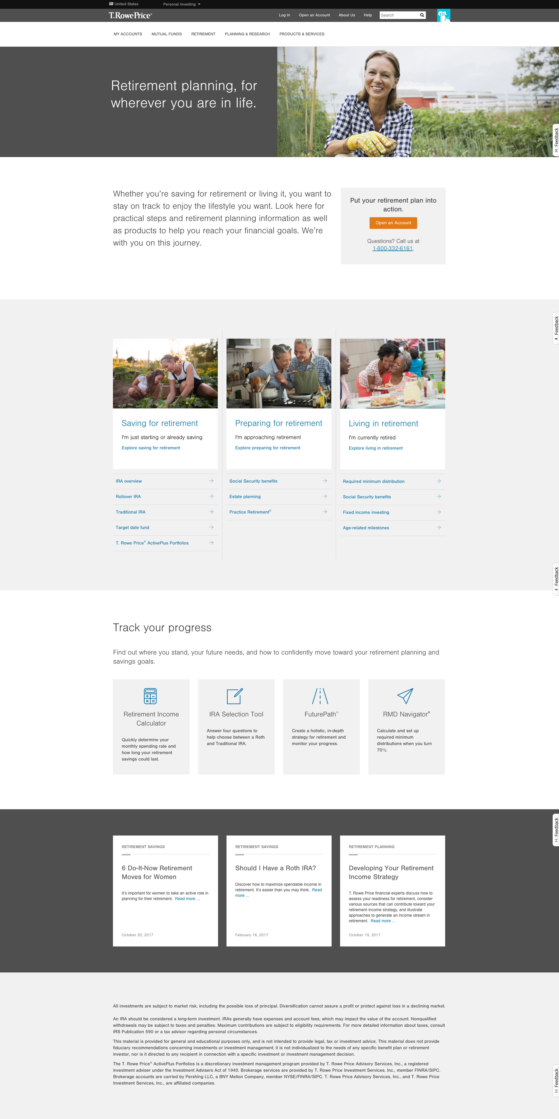
Over the years, the various topics covered in this section had been owned and maintained by various departments. Some content was actively maintained, while other content was several years old. When the time came to upgrade the firms content management system and implement a responsive website, the decision was made to holistically approach the section from the ground up.
Approach
The process for this project took place over the course of 10 months. Our working team was co-located in a dedicated workspace for a majority of the project, and leveraged daily standups and Scrum methodologies throughout the effort.
Team
Business Partner:
Product Owner
UX Working Team:
Project Manager (UX Scrum Master)
4 UX Designers
1 Content Strategist
Implementation Team:
Business Analyst
Development Scrum Master
3 AEM Developers
1 Web Content Specialist
Task
Re-architecting the entire Advice and Planning section from the ground up. This included:
- customer discovery to eliminate assumptions
- content analysis and strategy
- a visual redesign based on the latest brand standards
- CMS implementation and capability enhancements
The effort would be considered a success if:
- customer confidence increases conversions and reduced call center volume
- the look and feel reflects the TRP brand while being accessible across all devices
- the implementation expanded the capabilities of the marketing teams to test and iterate on messaging and content
Discovery
Roughly 2/3rds of this project was dedicated to the product and customer discovery process.
Finding a Baseline
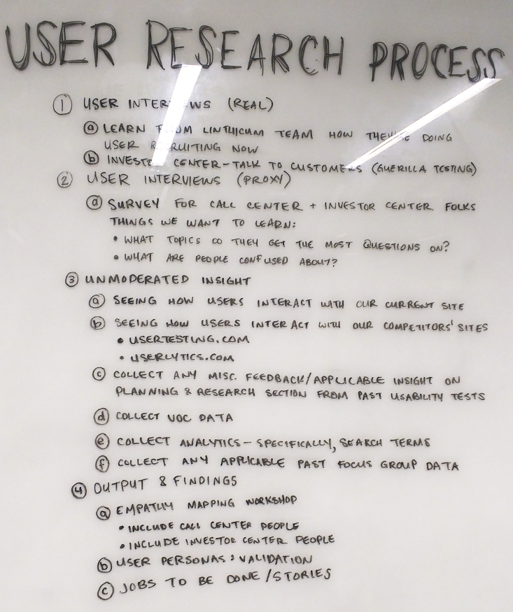
Existing experience analysis included:
- Analytics and visitor behavior
- CMS capabilities & limitations
- Web content and assets
Business analysis included:
- Stakeholder Workshops
- SME Interviews
- Competitor Usability Testing
Customer research included:
- User interviews
- Call center observation
- User story generation
Key Learnings
Large financial decisions were triggered by significant life events, often on the best and worst days of people’s lives.
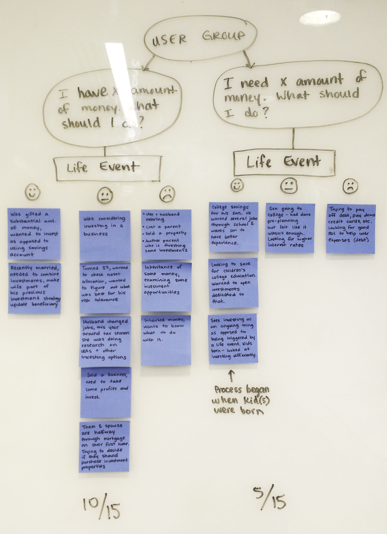
Information Architecture
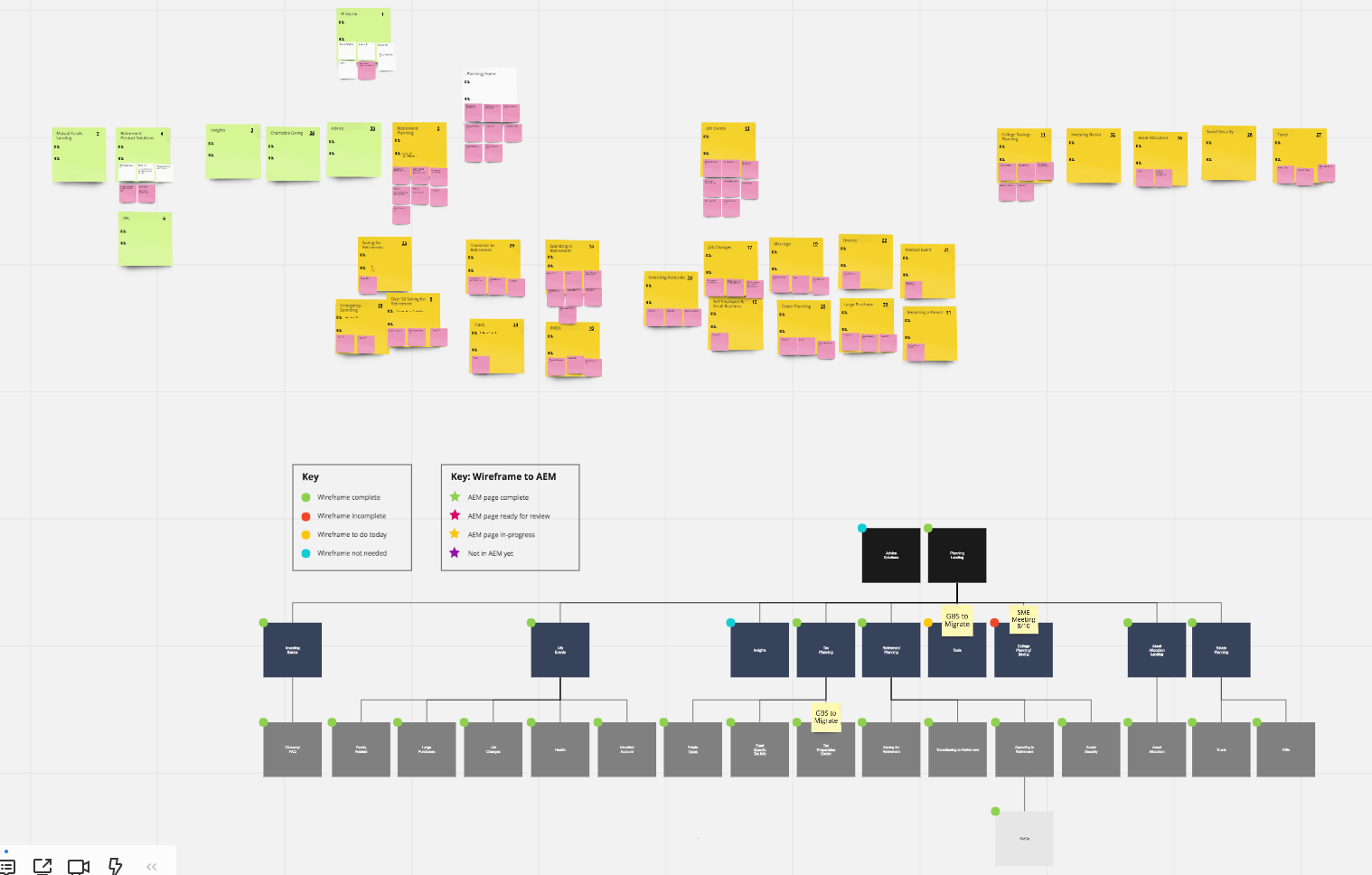
With our baseline established and our customer research honing our focus, we started to define the architecture. Our user stories and jobs-to-be-done fed into a DoGo exercise. This allowed us to address user needs at each step of their journey. As the DoGo stabilized, we were able to define our sitemap.
Methodology included:
- User Stories / Jobs-to-be-done
- User Journies
- DoGo Mapping Exercise
- Sitemap Exercise
Content Development, Testing, and Wireframes
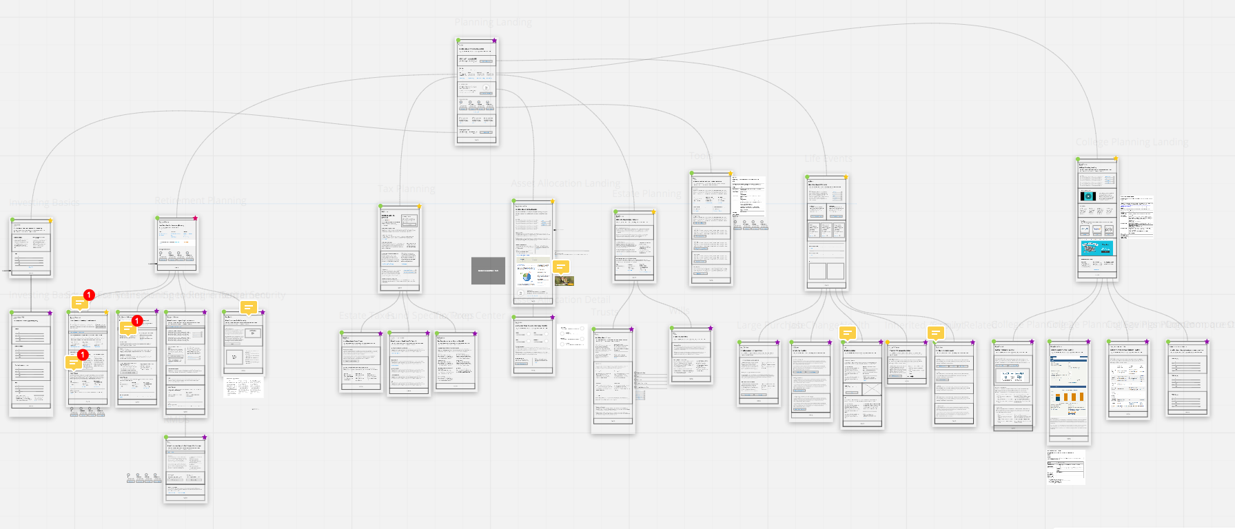
The content for each page was outlined and on-page hierarchy was decided using Page Tables. Messaging was tested, and wireframes were created with the approved copy.
Methodology included:
- Page Tables
- Remote unmoderated messaging testing
- Team wireframing in Realtime Board
UI Design & Implementation
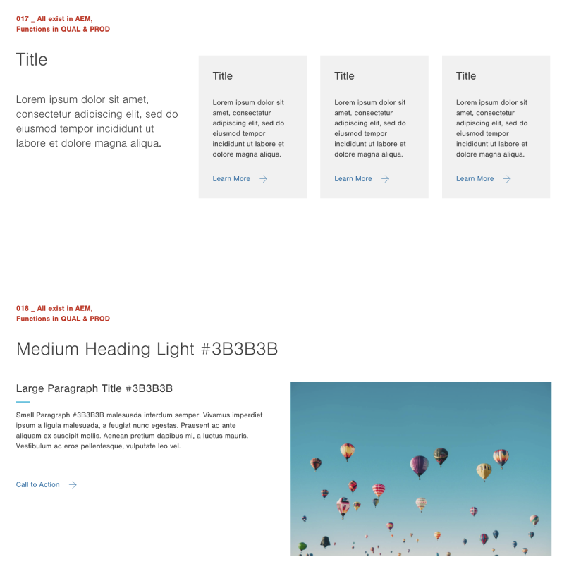
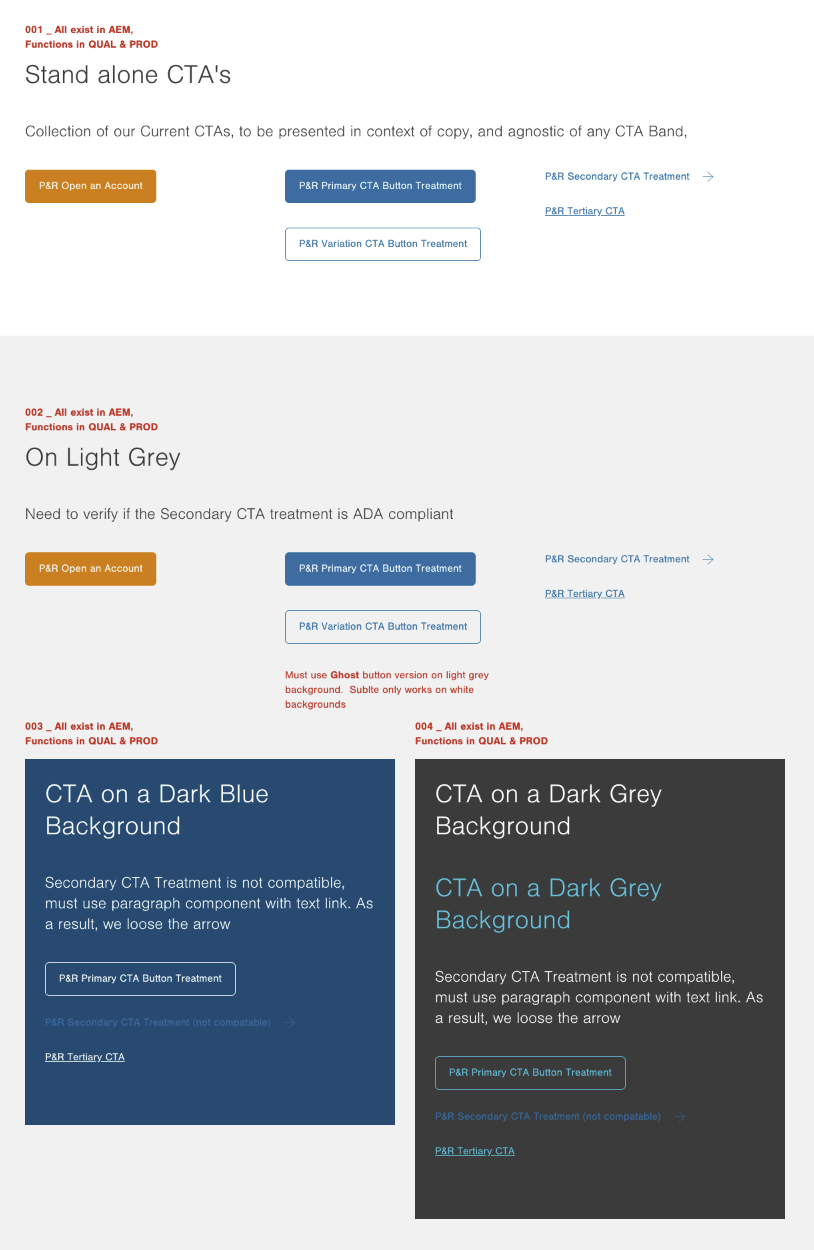
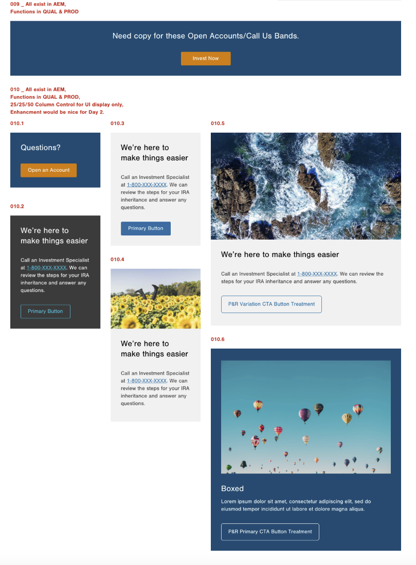
With our CMS, we were able to build the UI in a protected live environment. This allowed us to prototype and test designs with the highest fidelity possible. Content needs directed new component capabilities, which were added to the developer backlog and shipped in two-week sprints.
Methodology included:
- UI pattern library development
- Adobe Experience Manager component development
- Remote unmoderated usability testing
- Scrum Ceremonies
